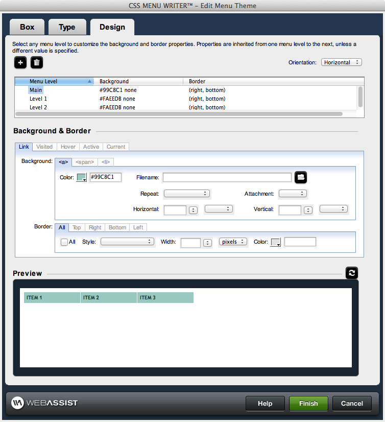
Design

Menu Level control
Selecting a menu component within the control enables the corresponding property controls immediately below it, allowing you to configure the properties of that component directly.
Add: Adds an additional menu level to the Menu Level Control, allowing you to customize the design for menu items at any level.
Delete: Deletes the selected level from the Menu Level Control. Design aspects for that level will be removed from the menu.
Orientation: Allows you to choose Horizontal or Vertical for your navigation menu.
Background & Border
In this section you can customize the background color or graphics for each element of your menu items.- Link: Applies to links that have not yet been visited.
- Visited: Applies to a link once it has been visited by the user
- Hover: Applies to an element while the user designates it with the cursor.
- Active: Applies to an element when activated by a user. For example, between when the user presses the mouse button and releases it.
li, span, and a
The background properties for the Link and Hover states of your menu items include options for <span> and <a>. These options are not available in Visited and Active states due to the cascading nature of CSS.<span>: Allows you to specify a right cap image to create a rounded edge appearance to your menu item.
<a>: Allows you to specify a left cap image to create a rounded edge appearance to your menu item.
<li>: Sets the background properties for the menu item.
- Color: Use the color-picker or enter the color value. The color value can be a color name (red) or a hex number (#ff0000). Note: A background image will overwrite any background color. If your background color is not displaying, ensure that there is not background image inserted in either the <a>, <span> or <li> tabs.
- Filename: Use the browse icon or manually enter the http:// location for a background image.
Note: If using different background images for the various states of your menu, these images must have different filenames irrespective of whether or not the images are stored in different directories. It is advisable that you store all images in the same directory before creating your menus. - Repeat: Sets how a background image will be repeated, if at all. Available options are:
- repeat: repeats the image vertically and horizontally
- repeat-x: repeats the image vertically
- repeat-y: repeats the image horizontally
- no-repeat: does not repeat the image
- Attachment: Sets whether the background image is fixed or scrolls.
- Horizontal: Sets the position of the image horizontally. Available options are left, center, right, or a numeric value. Numerical values are entered directly with the following unit standards available for selection: pixels, points, in, cm, mm, picas, ems, exs, %
- Vertical: Sets the position of the image vertically. Available options are top, center, bottom, or a numeric value. Numerical values are entered directly with the following unit standards available for selection: pixels, points, in, cm, mm, picas, ems, exs, %
Highlighting Current Page
CSS Menu Writer 2.0 allows you to higlight the menu item associated with the page that is currently being viewed.
The following options are available regarding this feature.
None: Turns off this feature and does not highlight any menu items.
Current page only: Only highlights the menu item specifically for the current page.
Top level of current page: Highlights the top level menu item that contains the current page.
Entire navigation route: Highlights the menu item for the current page, and all higher level items that lead to the current page.
Border
This section sets the border properties for the selected menu component. You have the option of setting the same border properties for all four sides of a component using the All tab, or setting individual properties for each of the four sides of a component: top right, bottom, and left. Enabling properties in the All tab disables configuration in the other four tabs. The border column in the Menu Level control, when All is selected, displays shorthand for the border attributes applied. Otherwise, it will display top, bottom, right, or left for any tabs with information entered.Preview
The Preview pane displays a representation of the menu's design based on the configuration options you have specified. The preview area within the 3-tab interface displays placeholder text instead of the actual text for your menu items.
Click once on the preview area to display the menu within your default browser. From the Design interface, your preview will only contain placeholder text.
After making any changes to your design, click Refresh to view those changes in the preview.