Box
The Box tab configures the width, height, margins, and padding for the layout components on your page.
Note: To ensure that resizing is handled correctly when defining the properties for layout components be consistent in the type of units used to specify attributes across all layout components.
Note: To ensure that resizing is handled correctly when defining the properties for layout components be consistent in the type of units used to specify attributes across all layout components.
Layout Component control
Layout components provide the structure for the layout of the page. Selecting a layout component within the control enables the corresponding property controls immediately below it, allowing you to configure the properties of that component directly. The following briefly describes the layout components and hierarchy used to structure your page layout and design:
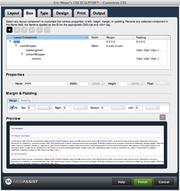
- body: the body tag for the page. Listed at the top of the layout control, this tag encompasses all content displayed on the page. Only the margins and padding are available properties for configuration for this layout component.
- outerWrapper: encompasses all of the <div> tags used to construct the page. Contains the three content subdivisions: header, contentWrapper, and footer.
- header: the top content region of the page, optional for display
- topNavigation: the top navigation region, optional for display. By default, the height is set to 25 pixels for compatibility with menuing systems.
- footer: the bottom content region of the page, optional for display
- contentWrapper: the central content region of the page, this area contains the content section, as well as any additional column(s) defined for the page.
- content: the central content area vertically between the header and the footer
- columns: additional content areas to the left and right of the central content area, vertically between the header and the footer
Note: When using these features to customize your layout components, it is important to refer to the preview area regularly to confirm that your modification will work as desired.
- Add: Allows you to choose whether to add a new div, or a Spry component such as collapsible panels, accordian panels, or tabbed panels.
- Remove: Removes the currently selected div element or Spry component.
- Move left: Moves the currently selected element left in the Component Tree Control which may cause the selected div element to wrap around one or more div elements to the right.
- Move right: Moves the currently selected element right in the Component Tree Control which may cause the selected div element to be wrapped within one or more div elements to the left.
- Move up: Moves the currently selected element up in the Component Tree Control.
- Move down: Moves the currently selected element up in the Component Tree Control.
Properties
This section controls the naming convention for each layout component, as well as the width and height for each.Name: Edits the name of the selected layout component
Width: Specify the width and select the units (if applicable) for the selected layout component. If a preset layout is selected on the Layout tab, any included columns use the width defined in the preset. If a preset is not selected (or a particular column's CSS is not defined in the preset), the column defaults to 100px wide.
Height: Specify the height and select the units (if applicable) for the selected layout component.
Float: Allows you to specify a float property for the selected <div> tag. Choose from left, right, or none.
Margin and Padding
This section controls the margins and padding for a selected layout component.Margin: the additional space allocated outside of a layout component between that component and any components it is within or adjacent to.
Padding: the additional space allocated inside of a layout component between the border of that component and any content/components within it.
Options for specifying the Margin and Padding attributes are identical, and are detailed as follows:
Padding: the additional space allocated inside of a layout component between the border of that component and any content/components within it.
Options for specifying the Margin and Padding attributes are identical, and are detailed as follows:
- All: When selected, sets the same value for all sides of the layout component using the Top entry.
- Top: Specify the top margin and select the units (if applicable) for the selected layout component.
- Right: Specify the right margin and select the units (if applicable) for the selected layout component.
- Bottom: Specify the bottom margin and select the units (if applicable) for the selected layout component.
- Left: Specify the left margin and select the units (if applicable) for the selected layout component.