Layout
The Layout tab configures the high level structure and design for the layout of your page. You can accomplish this by:
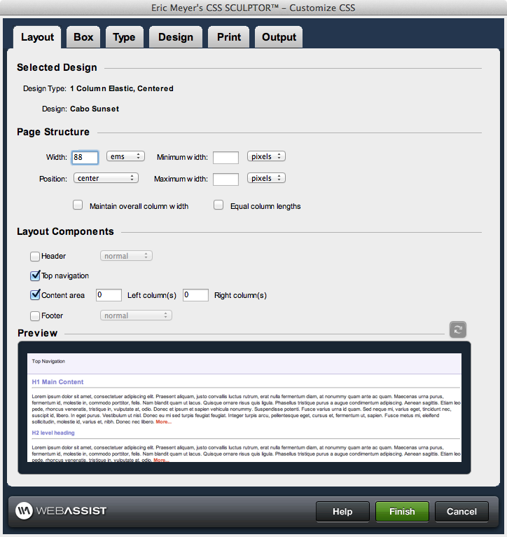
- configuring positioning and width properties for the content on the page
- specifying if there is a header, footer, and the number of columns, if any, to place on the page
- customizing the content areas, positioning, and width based on existing preset layouts, or starting with the default settings
Page structure
The Page structure section controls the width and alignment properties for all your content on the page.
Note: All of the page structure CSS properties are applied to the outerWrapper (see Box tab for more information). If the selected position is left, the margins are set to 0. If right is selected, the left margin is set to auto and the right margin 0. If center is selected, the left and right margins are set to auto.
Width: overall page width and the units used to define them.
Position: the horizontal position of all content
Minimum width: minimum width of outerWrapper
Maximum width: maximum width of outerWrapper
Note: Browser support for minimum width and maximum width is limited to Internet Explorer 7, FireFox and Safari. Other browsers ignore these CSS properties, and should be taken into consideration for your design requirements.
Maintain overall column width: maintains the overall width of a column when the padding, margins and borders are adjusted.
Note: In order to apply this feature the measurement type needs to be consistent for all elements in your design.
Equal column lengths: Applies the faux column technique on columns ensuring that they remain the same height as the content area.
Note: This option is only available with fixed width designs.
Note: The faux column technique requires the use of a background image which is automatically created by CSS Sculptor 2.0. When finishing the CSS Sculptor wizard and creating your completed design, this image is stored in the images directory of your defined site.
If you have a background image applied to your content area and the Equal column lengths option selected, you may notice from the preview that the background image is being horizontally repeated. In this situation, you may need to make additional modifications to the slice created by the Equal column lengths feature, or adjust the CSS to accommodate.
Layout components
The layout components section is used to specify which components are used to build the basic framework of the page. This is accomplished by specifying the content area, the number of columns to the left or right of the content area, and whether there is a header and/or footer in the page.
Header: Includes a header layout component. Comprised of a single div across the top of the page. Choose normal or full width from the menu list.
Top navigation: Includes a Top Navigation component below the Header.
Content Area: Includes a content layout component. Comprised of multiple divs that help structure a central content area, as well as columns immediately to the left and right of it. More information on additional layout component structures can be found in the Box tab.
Left column(s): # of left columns included. Requires Content area to be checked.
Right column(s): # of right columns included. Requires Content area to be checked.
Note: If adding additional columns with a non-pixel based layout, you may need to make adjustments to the margins in the Box tab.
Footer: Includes a footer layout component. Comprised of a single div across the bottom of the page. Choose one of the following options from the menu list:
- normal: Footer displays beneath the content areas of the design.
- full width: Footer expands the full width of the browser window beneath the content areas of the design.
- fixed normal: Footer displays fixed at the bottom of the browser window, maintaining the same width as the content area of the design.
- fixed full normal: Footer displays fixed at the bottom and stretches the full width of the browser window.
Combining Full Width Headers and Full Width Fixed Footers - If using both a Full Width Header and a Full Width Fixed Footer, you will want to start your design by using the "2 Column Fixed, Header and Fixed Footer" preset. This preset uses images to achieve the desired effect, and prevents the footer from appearing below the browser window.